Tuesday, April 28, 2009

Yah Baby!


Alright, so I'm doing the Austin Powers Trilogy since it has never had its deserved boxset release and it is going to be an 8 panel digipak with 3 discs that will fit into a slipcase. The slipcase will be wrapped in a blue velvety type material and have a metallic male symbol on the front. I haven't got a whole lot done so far but this is the die-line I am using, but I have to add a folder/pocket on the side of it.

and this is what I have worked on so far. They are the 3 panels that the disc will be in and I imposed a dvd tray over the top to show what it will look like when it is actually produced....

I think on the other side of the digipak panels, I will incorporate the three girls from the movies somehow, maybe similar to how austin, mini me and dr. evil are done, maybe differently, I'm not sure yet.

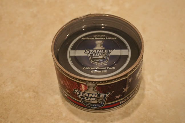
And last but not least, I'm sure about 2 of you will understand this(including joe)... but...


go wings!


Monday, March 16, 2009

Pop Art!

This has nothing to do with packagaing design(for the most part) but I thought it was cool enough to post a blog on it...

I went to LACMA over the weekend and they had a gallery that was part of the collection of Eli and Edythe Broad and they had a good selection of Andy Warhol pieces and I've never seen any of his work in person so it was really cool, especially the Rorschach piece...They didn't let us take pictures but I snuck a few anyhow so here they are...


Wednesday, March 11, 2009

Tuesday, February 17, 2009

refinements...


I added photography, retouched the layouts and created a completely diffeent clock for the easy mac in illustrator...

I am going to make a kids mac n cheese which will include cartoon characters (possibly spongebob, nickelodeon classics or simpsons...or all 3)

PEACE


Tuesday, February 3, 2009

Sketches

Sketches for packaging can be viewed here

Monday, January 26, 2009

most triumphant..and most heinous.


Most Triumphant Packaging
Nightmare On Elm Street Box Set:

The colors help portray the same creepy feeling that all of the films do yet the box still catches the consumer's eye as the images of Freddy Krueger are embossed, rather than just simply printed.
The back side is simple and to the point and shows you the contents of the box set which include all 7 movies, a disc of bonus features and a booklet with information on all the films as well as pictures.
The spines of the dvd's are all designed so that when put in the box together, they create a picture of Freddy Krueger with his back turned toward us.
The dvd's themselves are designed the same way so it is obvious that they all belong together. Even the 3D glasses for "Freddy's Dead" are branded with the Elm Street logo.

2008 Stanley Cup Finals Official Game Puck:
The packaging is simple and very compact to where the puck fits in it perfectly without any room to move around and get scratched.
Once the puck is take out of the package, the lid can be placed upward at an angle and it makes for a great display stand for the puck
Apple iphone:
The outside is very simple and sleek with a matte black base and a full size image of the product inside along with it's name and logo. Simple is the way to go in my opinion and no one does it better than Apple.
The functionallity of the package is great as well, there is a plastic tray to hold the iphone itself and everything else fits in perfectly designed slots beneath it as seen in the picture below...
Most Heinous Packaging
180 Energy Drink:
At first glance, 180 energy drink seems like your typical, run of the mill drink package, nothing great, nothing too bad, but then....
You turn the can around and notice that the designers thought that they were clever by putting same design on the other side but turned over 180 degrees. Now, I see where they are coming from with the concept, but that means that there is a 50 percent chance of this drink looking like it is upside down on the shelf and no one wants to have to turn their heads weird to read what the drink is called and flavored with. 
Eggo Waffle Brand Syrup:
The designers of this package thought it would be cute to make the eggo brand syrup look like an eggo waffle and it really doesn't look all that bad and it goes well with the packaging of the waffles. The bad thing is that they forgot that a big round tub of syrup doesn't exactly fit well into the human grip. It is not as easy to hold as most syrups which have thin areas on the bottle so it is easy to wrap your hand around.

Paul McCartney's "Memory Almost Full" deluxe edition cd:
The cover design is pretty cool but the problem here is that this is a cd and they have it in a dvd sized package. This makes it a pain in the ass to store with your other cd's and you are forced to put it with your dvd's. Who goes through their dvd collection to find a cd to listen to???

This is also something that bugs the hell out of me and it seems to be getting used more and more lately. Putting disc two of a 2cd or dvd set under disc one means that you have to take disc one out just to get to disc two. The more you handle a cd or dvd, the better a chance of it getting scratched is and that leads to poor playability. So, while the design in terms of graphics and layout is actually quite amazing on this package, the functionality fails on multiple levels.

PEACE

Followers